Healthcare Infographics Series
Complex problems don’t need more noise. They need clarity.
This series of infographics was designed to break down one of healthcare’s most persistent challenges: the disconnect between provider data accuracy, network adequacy, and real patient access.
Across three pieces, we turned dense regulatory concepts and fragmented system challenges into something simple, visual, and actionable.
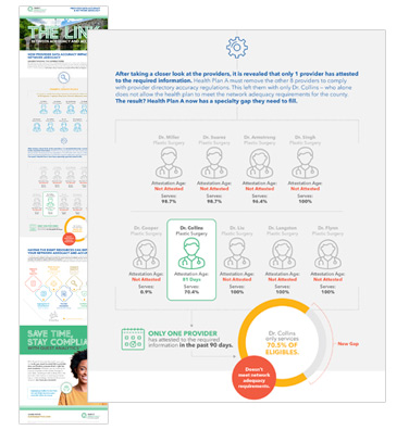
The Link
Where accuracy and adequacy collide
At a glance, a provider network can look complete.But when data isn’t current, the reality tells a different story.
This piece visualizes how quickly network adequacy can fall apart when provider data isn’t verified and maintained. What appears compliant on paper can collapse under scrutiny.
As shown in the example, removing outdated providers can instantly create coverage gaps and compliance risk.
What this does well:
- Turns abstract compliance into a real-world scenario
- Makes the ripple effect of bad data immediately visible/li>
- Bridges the gap between technical teams and decision-makers/li>
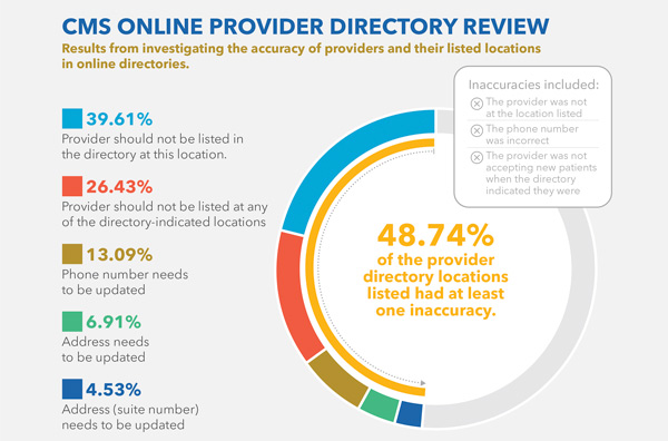
The Inflated Network
When your data lies to you
Many health plans believe their networks are strong.
The data says otherwise.
This infographic exposes how inaccurate provider directories create a false sense of coverage. In some cases, less than half of listed provider locations are accurate.
The result:
- Members can’t find care
- Plans fall out of compliance
- Trust erodes quickly
What this does well:
- Anchors the story in real CMS data
- Highlights the human impact, not just the technical issue
- Connects inaccuracies directly to member experience
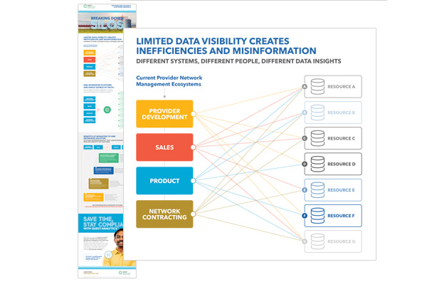
Breaking Down Silos
Too many systems. Not enough truth.
Behind inaccurate data is a deeper problem: fragmentation.
Different teams. Different tools. Different versions of reality.
This piece reframes the challenge from a data issue to an organizational one, showing how siloed systems create inefficiencies, misalignment, and missed opportunities.
The solution isn’t more data. It’s connected data.
What this does well:
- Elevates the conversation from symptom to root cause
- Positions integration as a strategic advantage
- Simplifies a complex ecosystem into a clear before/after story
Bringing it together
From complexity to clarity
Each infographic stands on its own. Together, they tell a bigger story:
- Data accuracy impacts access
- Access impacts outcomes
- Systems determine everything in between
- The goal wasn’t just to inform.
- It was to help teams see the problem differently.
The impact
Making the invisible visible
This series helped:
- Simplify highly technical healthcare concepts
- Create alignment across business, product, and compliance teams
- Turn abstract challenges into clear, visual narratives
Most importantly, it gave stakeholders a shared understanding of a problem that’s often buried in spreadsheets and systems.
Because when people can see the problem… they can finally start solving it.